How to Visualize Layered Data to Show Holistic Relationships
I worked on infographics for one chapter of UNDERSTANDING USA, a TED conference textbook, in the year 2000. So why talk about infographics from such an old book now?
The loss of my favorite teacher, Krzysztof Lenk, gave me an opportunity to reflect on what I worked on under his direction back then. What I realized was that there are so many insights from this project that can still be applied to today’s work — for UX designers and information designers alike. I would like to share my re-discovery of the project.
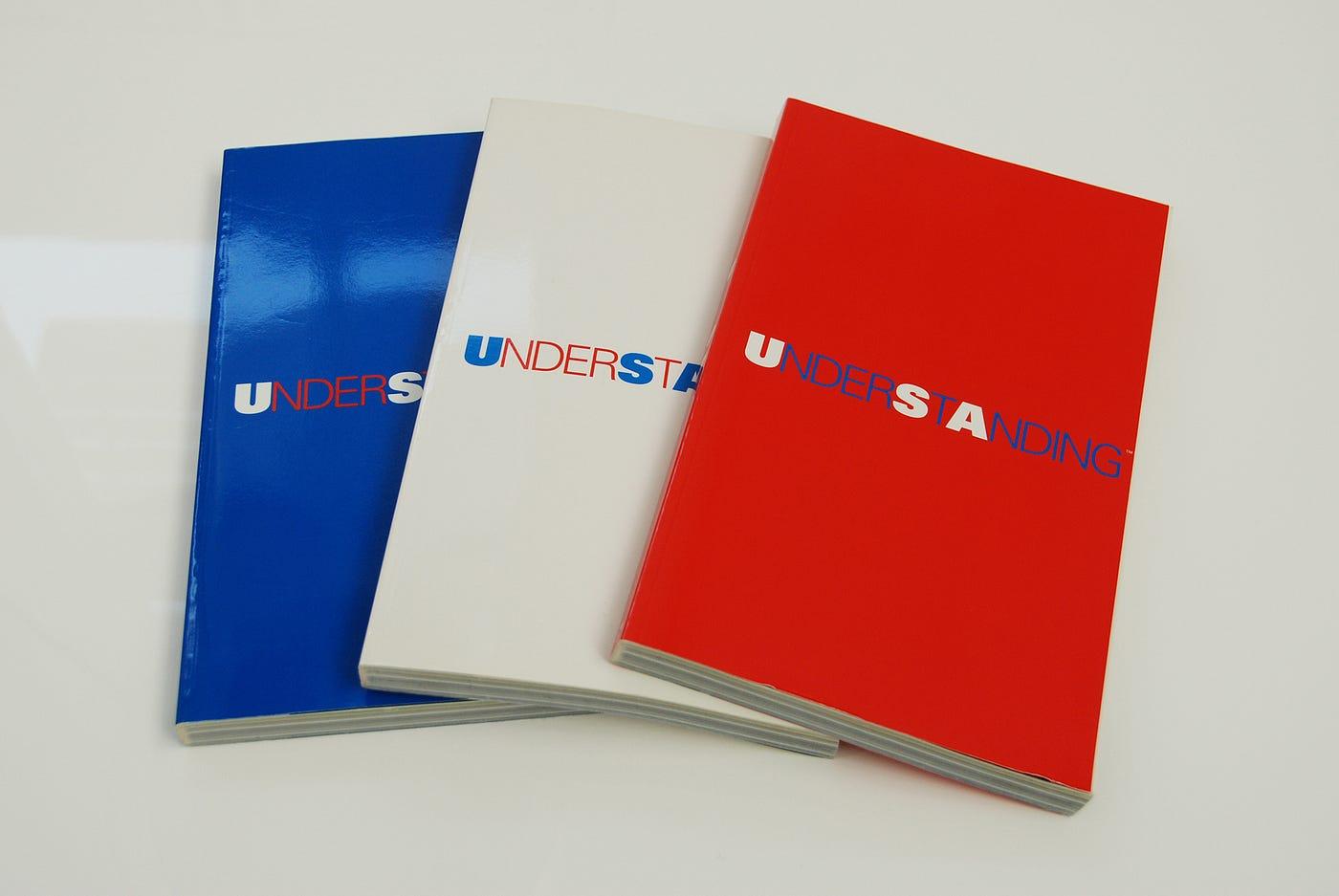 UNDERSTANDING USA — the TED 2000 conference textbook, published in three color variations
UNDERSTANDING USA was a textbook for the TEDX conference, which took place in Monterey, California, on February 23–26, 2000. This was the same conference where the Global Village animation (which I wrote about in a previous article) was presented. I initially worked on UNDERSTANDING USA before Global Village.
In 1999, Krzysztof Lenk and Paul Kahn from Dynamic Diagrams were invited by Richard Saul Wurman — the founder of TED — to be part of a team of 12 information architects contributing to the book. I had the opportunity to work with Krzysztof and Paul on this project.
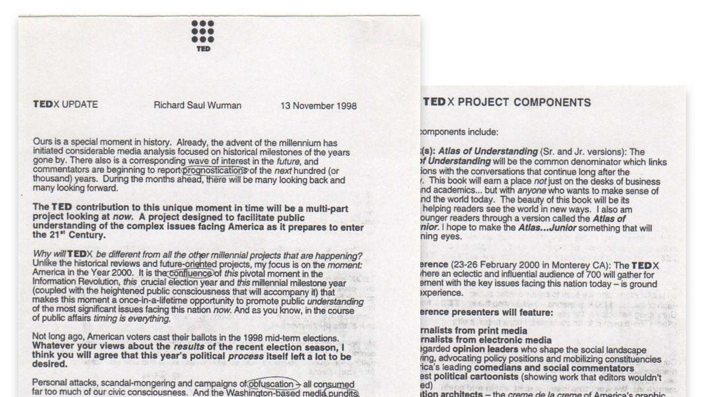 A copy of the TEDX UPDATE letter by Richard Saul Wurman, November 13, 1998
Below is a quote from Richard Saul Wurman on how he introduced the concept of UNDERSTANDING USA in his letter to contributors on November 13, 1998 — he initially called it “Atlas of Understanding”:
To answer the complex TEDX questions, my staff and I are researching government statistics, recent studies by foundations and think-tanks, timely articles by leading journalists and relevant material from industry groups and trade associations. The resulting book will be the Atlas of Understanding — a comprehensive fact-based guide to the fruits of our research. The Atlas will be the TEDX Bible, its blueprint, its compass and its yardstick — striving to be Solomonic in its fairness and impartiality.
But please don’t make the mistake of thinking of this book’s neutrality as something dry, academic and boring. On the contrary, I intend to make the Atlas a showpiece, a demonstration of how complex data can be accessible, engaging and entertaining — without sacrificing its integrity or its nuances. How? There exists within the upper echelon of America’s graphic designers an elite group I call the Information Architects. These talented designers will condense the TEDX research into its most revealing and informative components. Their extraordinary graphs, maps, video, computer simulations and a host of other media will bring the TEDX information to life. The Atlas will be like a master class in effective information design. Trust me; it won’t be boring.
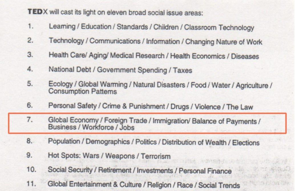 The eleven broad social issue areas defined by Richard Saul Wurman for the TEDX Conference
When Krzysztof and I visited Richard Saul Wurman’s house in Newport, Rhode Island, we were handed a box full of statistics — hundreds of pages. The topic our team was assigned was “Global Economy / Foreign Trade / Immigration / Balance of Payments / Business / Workforce / Jobs,” one of eleven broad social issue areas Richard defined for the conference.
Deep dive into piles of statistical data
 A glimpse of the actual statistical data provided by Richard Saul Wurman for the project
Typically, most design work starts with content that is already curated, edited, and selected by a client, an editor, or a writer. However, in this project, we were able to start from scratch — choosing which statistics to pick from piles of raw data, loosely organized around broad questions provided by Richard Saul Wurman as a guide.
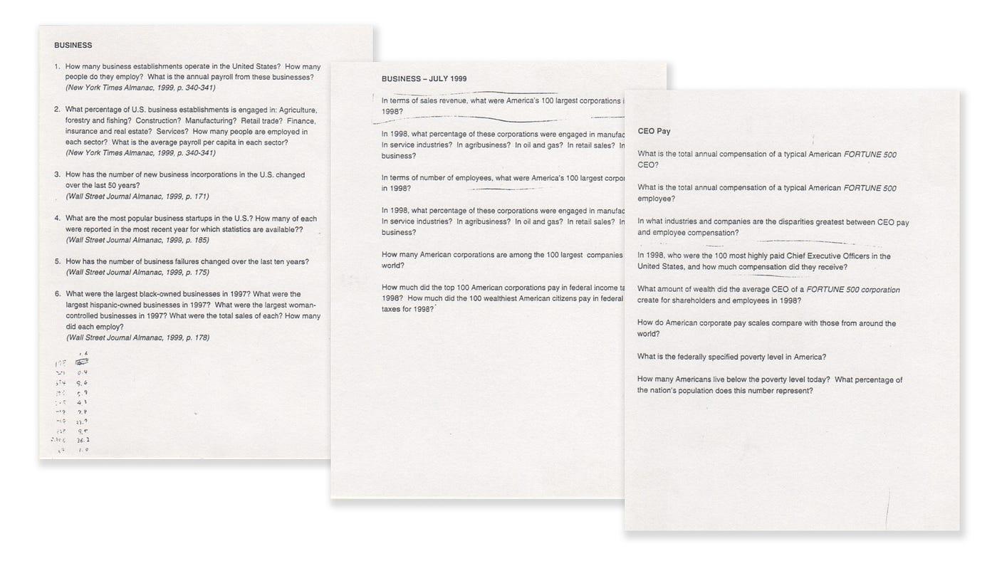 Key questions provided by Richard Saul Wurman to guide the data selection process
Obviously, in order to pick and choose, you first need to fully understand all the statistics packed in that box. This by itself was a lot of work — but it was also a lot of fun, getting immersed deeply in a sea of data.
In the box, statistics were organized by folders based on topics. Krzysztof would give me one or two folders at a time, and I would take those home, scrutinize all the data, take notes, make hand-drawn graphs and charts from tables, and play back my learnings to him at the next meeting at his studio.
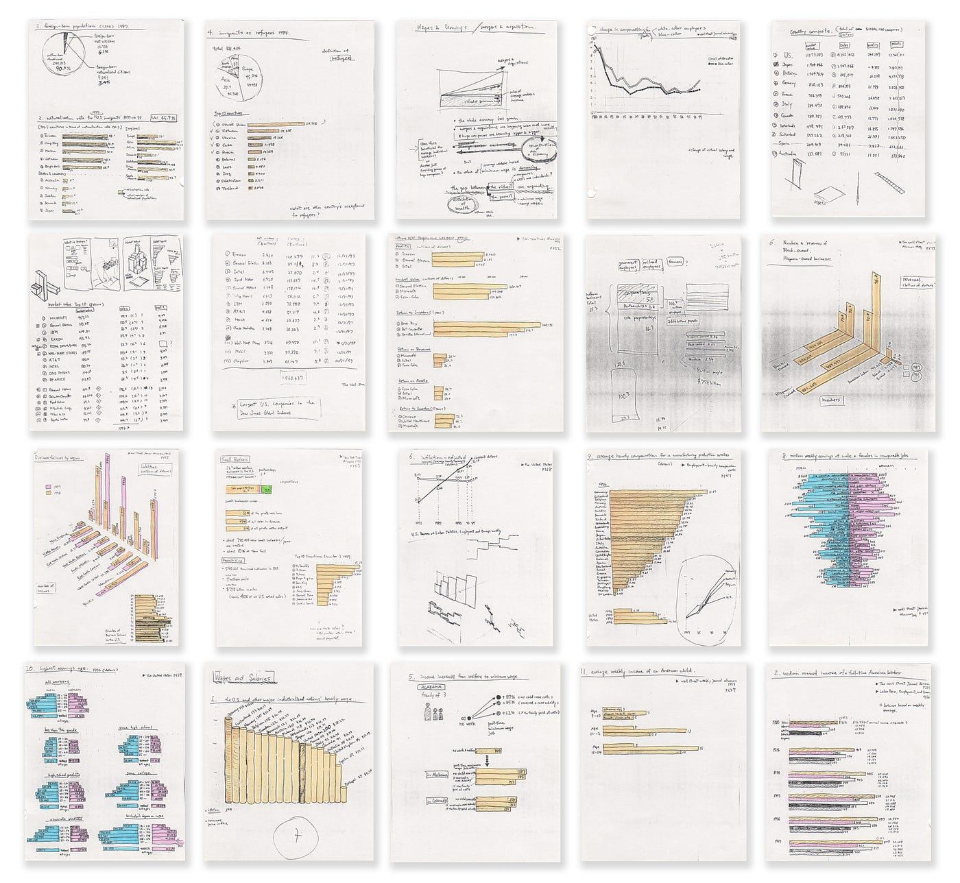 Hand-drawn sketches made during the data-immersion process for UNDERSTANDING USA
When I went through this data-immersion process, I gradually started to paint a picture — started to connect dots. Then I was hit by various “ah-ha” moments when connected dots came together suddenly and started to shape new meaning.
Visualizing layered information effectively and holistically to show its inter-relationships
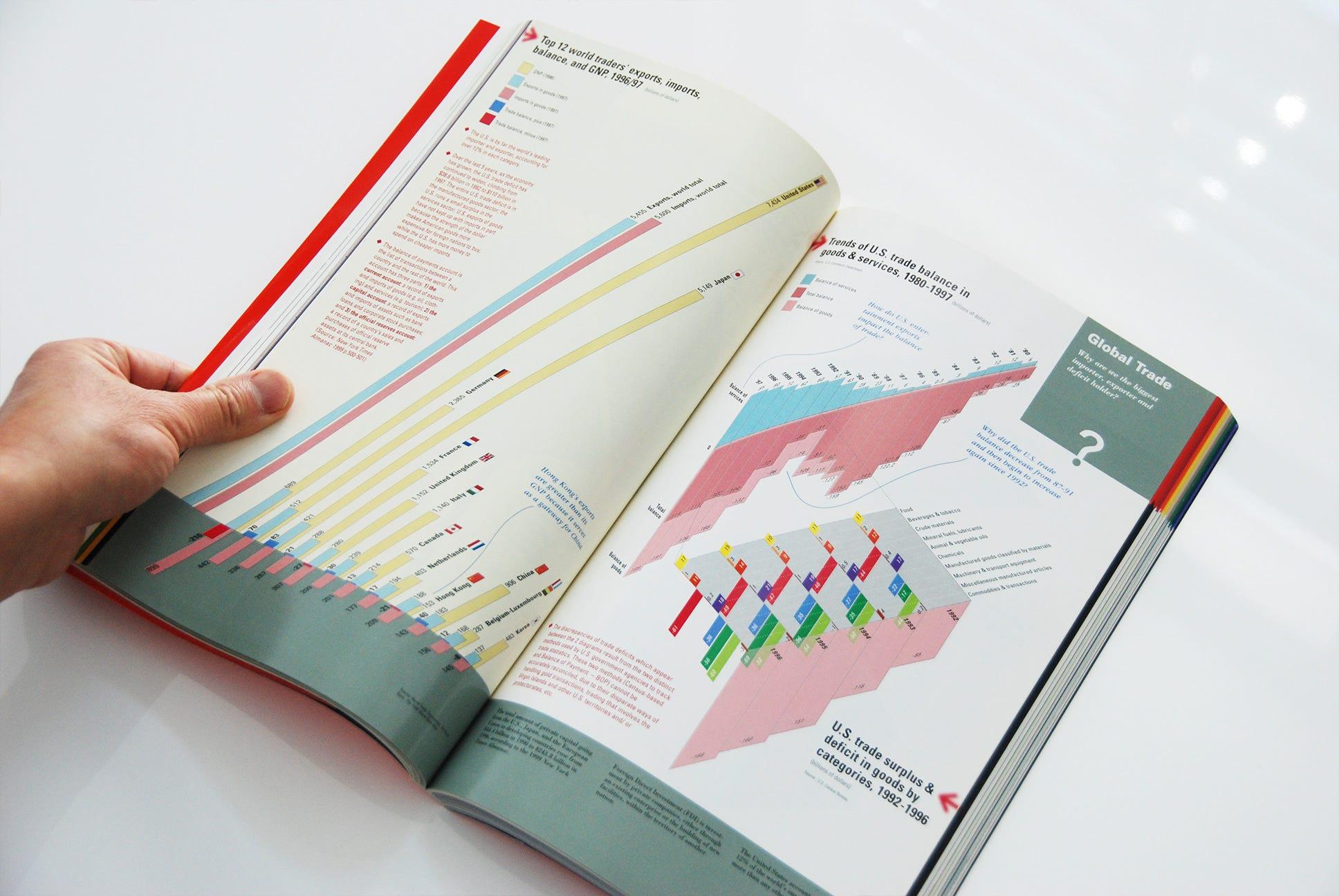
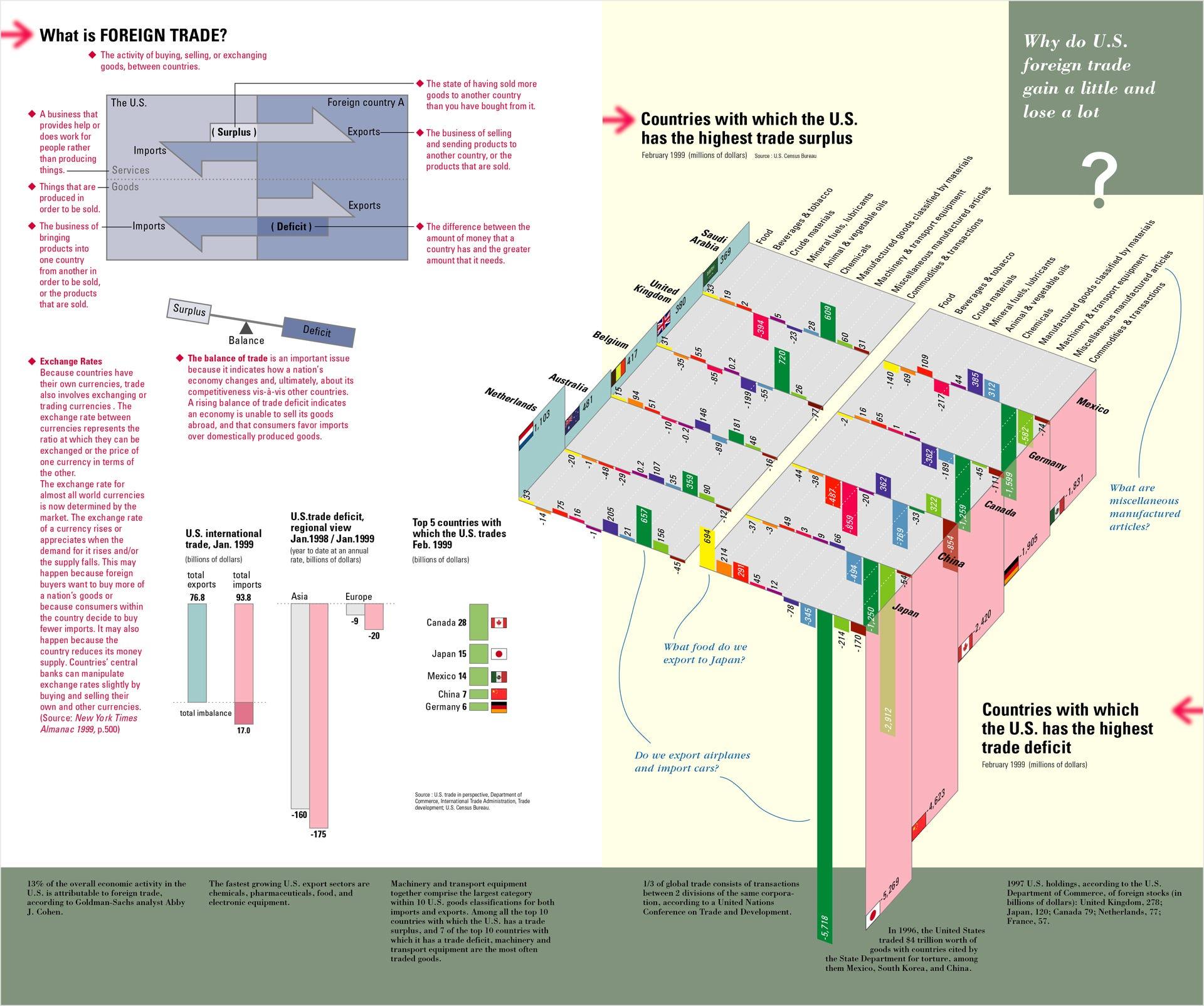 The Foreign Trade spread from UNDERSTANDING USA — “Why do U.S. foreign trade gain a little and lose a lot?”
One of the interesting things from an information design perspective that came out of this project was how to visualize layered information effectively and create a holistic view of encapsulated data and their relationships.
The spread above shows data about foreign trade, built around a simple question: Why did U.S. foreign trade gain a little and lose a lot?
The spread was designed so that a viewer naturally moved through a three-step progression to fully understand the information:
- (A) Introducing a basic definition of foreign trade — what trade surplus and deficit meant, through a simple diagram
- (B) A basic concept of the balance of trade, top countries the U.S. traded with, and how the U.S. ran large trade deficits
- (C) The highlight of the story — a pair of three-dimensional diagrams on the right page, illustrating a stark contrast side by side: the top five countries where the U.S. had trade surpluses, and the top five where the U.S. had trade deficits, as of February 1999
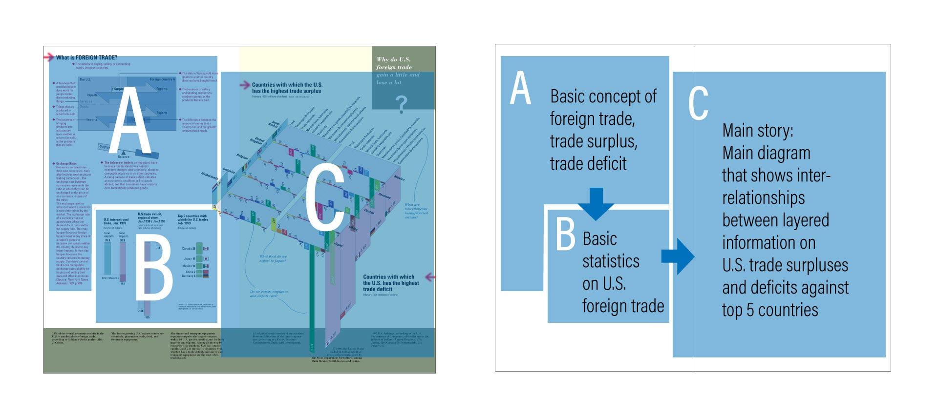 The information architecture of the spread: a 3-step progression from definition to context to main story
These three-dimensional diagrams attempted to highlight stark contrasts at multiple levels simultaneously:
- An overall trade surplus vs. deficit — and the deficit was overwhelmingly large
- Among the top five deficit countries, Japan and China stood out significantly
- Among the top five surplus countries, the Netherlands stood out slightly — but was no match for how Japan and China dominated the deficit side
- Machinery and transport equipment was the biggest category in both surplus and deficit, with the deficit from Japan being the largest by far
Some people might question the use of three-dimensionality here. But our team — primarily Krzysztof and myself — concluded that this three-dimensional approach enabled not only an aesthetically intriguing visual impact but also a meaningful interrelationship between complex layered data. As a result, while it did require some time to decode the diagram’s meaning, we were able to create a holistic view of the foreign trade problems the U.S. faced at the time — presenting all of the above in a single pair of diagrams.
Below is the basic process our team went through from data analysis to final design:
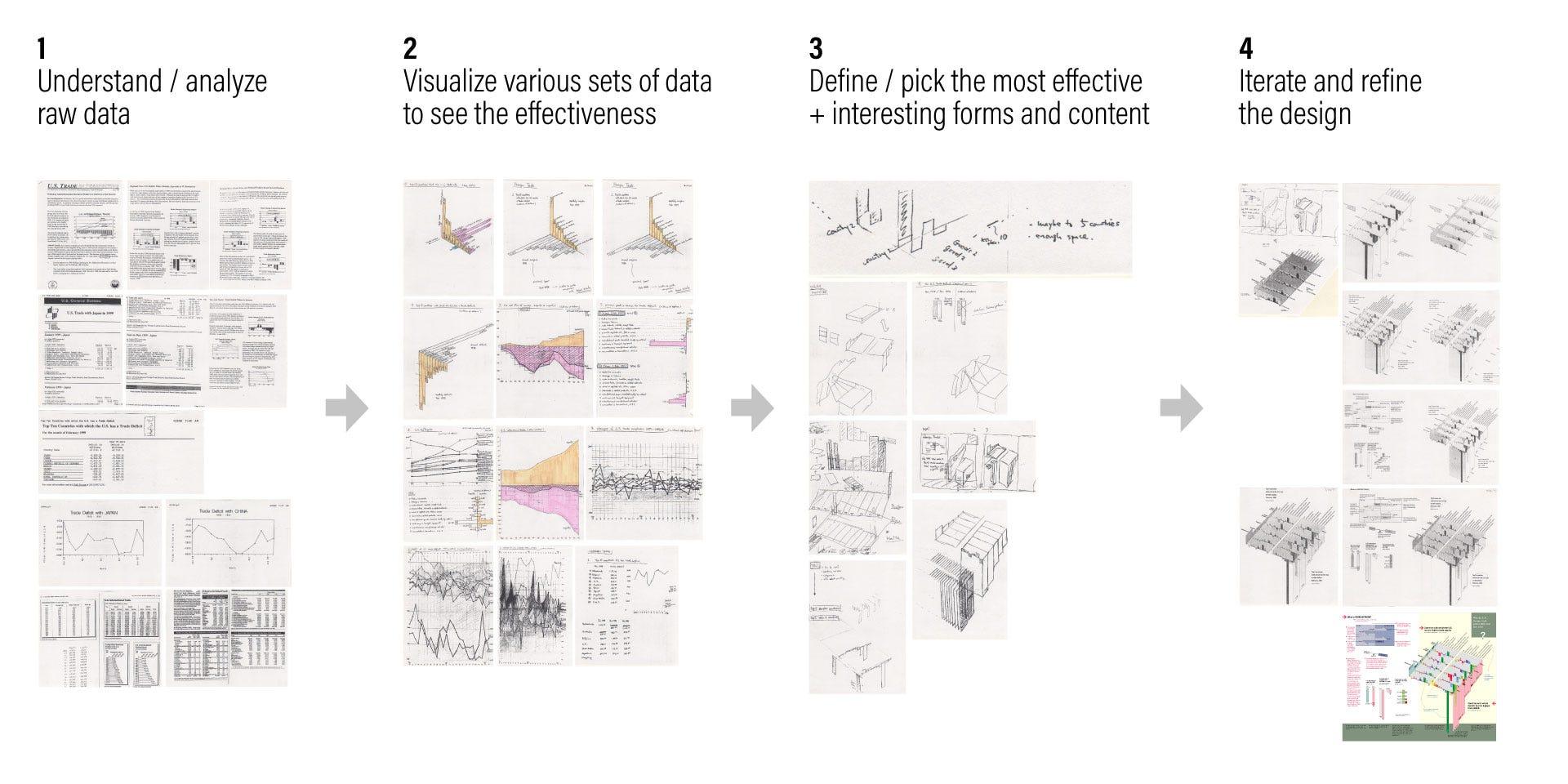 The process: from understanding raw data to visualization, definition, selection, and iteration
Making information understandable to humans — holistic overview, broad patterns, and interrelationships
Today, we live in a high-paced information world where enormous amounts of data are constantly captured via sensors, collected via software, analyzed via machine learning, and visualized through computer automation. Data visualization is ubiquitous.
More than ever, we need designers to create frameworks for these visualizations to accommodate ever-increasing demands. Because most data visualizations now require data to be fed into template designs automatically, design is increasingly slipping out of designers’ control.
Computers have a superior ability to perform astronomically complex calculations in a second. But at the end of the day, it’s humans who make good use of the data collected, calculated, and presented by computers. In order for us to grasp the meaning of data, we need to visualize it in a way humans can comprehend.
Humans are bad at precision and massive calculations. What humans are good at, however, is seeing the forest as a whole — rather than precisely counting how many trees make it up. We seek holistic overviews, broad patterns and trends, and interrelationships between various data points. These are what we base our actions on. These are the things that designers are responsible for. And I believe these are the areas where we as humans are still better than computers.
Designing for a user naturally puts the user and the content at the center
Because 12 designers were invited and each designed their assigned chapter, the book as a whole ended up somewhat chaotic — even though the information it contained was genuinely amazing, and it certainly became the entertaining showpiece Richard Saul Wurman envisioned.
It was fascinating to see how various information architects ended up flexing their visual muscles with cool effects, vibrant colors, and beautiful pages. On the contrary, Dynamic Diagrams remained grounded with a more controlled, classic visual design style — focusing on the content rather than presentation effects.
Ironically, Dynamic Diagrams stood out from the rest.
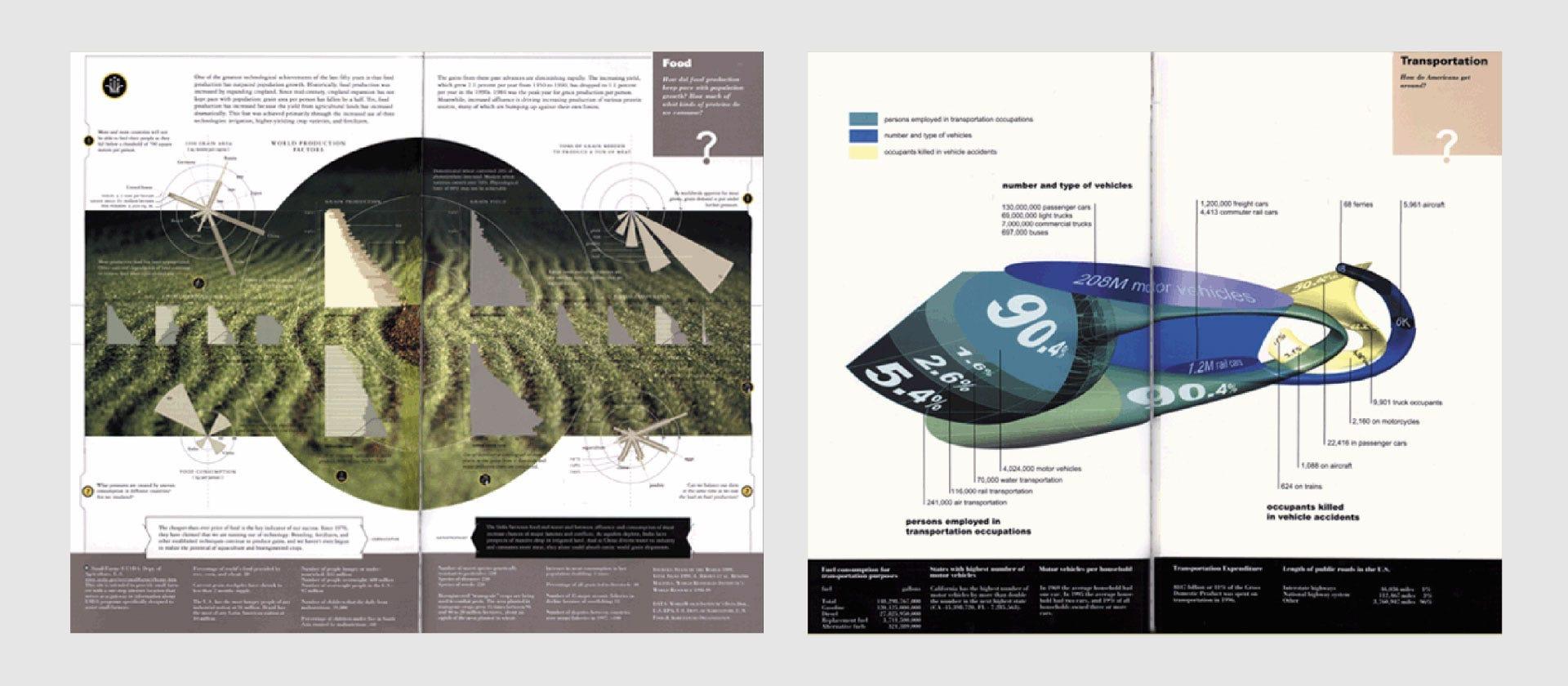 Pages from other contributing information architects, UNDERSTANDING USA
The spread on the left was designed by Ramana Rao, presenting “Food: How did food production keep pace with population growth?” The page was beautifully designed and successful in attracting viewers — but a dominant photograph took too much attention away from the graphs themselves, making the graphs look insignificant.
The spread on the right was by Hani Rashid and Lise Anne Couture, visualizing “Transportation: How do Americans get around?” The sculptural object was intriguing because it was so unusual. Again, it stimulated curiosity — but the way the statistical graph was mapped onto such an irregular form made it extremely hard to read.
This brings us back to a principle of user-centered design that has become common practice for today’s designers, particularly UX designers.
Whether it’s a user experience for a digital product, a data visualization, infographics, or any other product — design should never be treated as a designer’s playground to selfishly satisfy themselves. Designers should always work for users, viewers, audiences. Design is a vehicle to deliver a message. When that is done successfully without ego, the design itself recedes to the background — almost becoming transparent — so that the viewer is fully immersed in the content itself.
These are the insights I re-discovered from a 20-year-old print infographics project: the importance of putting the user and the content at the center as a designer, which is the very essence of user-centered design. To properly execute this, you need to go through content analysis to acquire a deep understanding of your content. And that deep understanding is what gives you the ability to present a holistic overview of information in a meaningful way — so that humans can easily comprehend and act upon it.
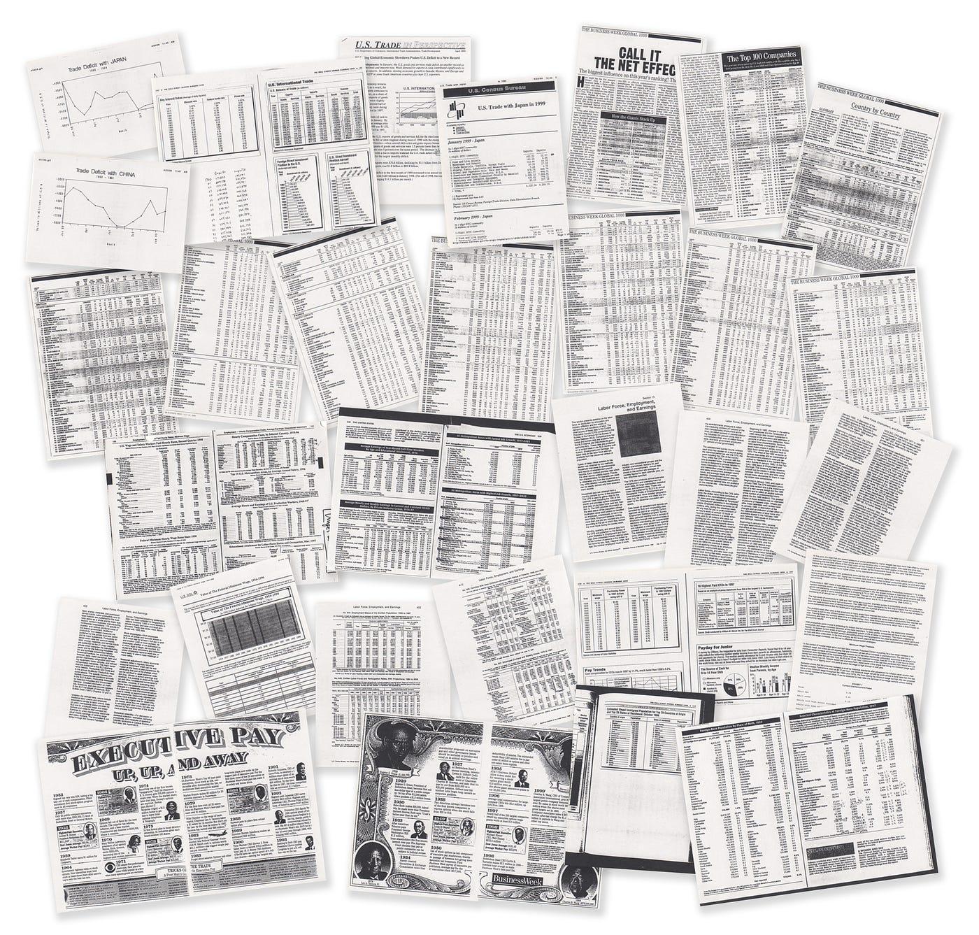
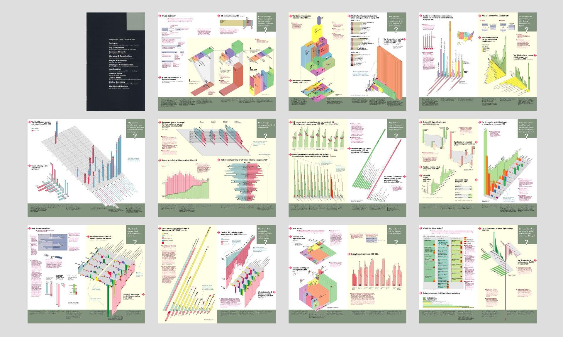 Chapter cover and all page spreads from the Business chapter, UNDERSTANDING USA
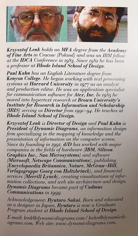
Krzysztof Lenk and Paul Kahn — as profiled in UNDERSTANDING USA
Richard Saul Wurman is an architect, information designer, and the founder of TED. He is also the author of Information Anxiety, one of the early books to address the problem we all face in today’s world — information overload — and coined the term “Information Architect.”
UNDERSTANDING USA was the textbook for the TEDX Conference in Monterey, California, February 2000. Richard Saul Wurman invited 12 information architects to design infographics on various social issues, including Krzysztof Lenk and Paul Kahn from Dynamic Diagrams. Krzysztof was also one of my thesis advisors at RISD.