Not so fancy (but meaningful) enterprise UX work
Veritas AppAssist mobile app, 2016–2019
Aspiring UX designers tend to focus on fancy, shiny user interfaces from Apple, Google, Facebook, Amazon, or futuristic opportunities such as AI and virtual reality.
While many UX designers work on high-profile products, far more UX designers deal with work that isn’t flashy—but still meaningful. I want to share one example: AppAssist. Hopefully this gives a glimpse of how UX designers work on those projects—and why they matter.
AppAssist was a mobile app that Veritas Technologies released in 2016. I worked on it as the lead UX designer.
Veritas offers data backup and management solutions for enterprise customers through a mix of hardware, software, and services. The hardware products are data storage appliances: large systems customers use to store data in on-site or off-site data centers.
Because these appliances are bulky servers with petabytes of storage, installations and repairs require specially trained hardware service engineers. Veritas partners with a third-party company for appliance installations and repairs. AppAssist was created to assist those hardware service engineers during installation and repair.
Installing appliance hardware at a data center was difficult work
Appliance installation usually happens in a harsh data center environment, where customers or third-party service engineers want to know what they need right away and finish as quickly as possible.
What do I mean by “harsh”? Data centers are filled with rows of server racks—enterprise systems with hundreds of disk drives. It gets very noisy from spinning disks and cooling fans. Room temperature is kept very low. Altogether, it’s an environment where you don’t want to spend more time than necessary.
 Appliance journey map
Appliance hardware installation was identified by the UX team as one of the biggest challenges in the appliance journey map. It was a complicated procedure that had to be done correctly under tight time pressure. Mistakes could mean another engineer visit (extra cost). Frequent calls to Veritas support during installation were another cost. In the end, customers paid the price: delays could postpone server deployments with serious business impact.
The enterprise world can be slow to adopt technology trends
Before AppAssist existed in 2016, Veritas already had supporting materials for installations—but mostly traditional PDFs meant for printouts and videos produced for internal training. Some engineers reviewed materials at the office before visiting a data center, or brought printed PDFs. None of it was fully optimized for real-world context.
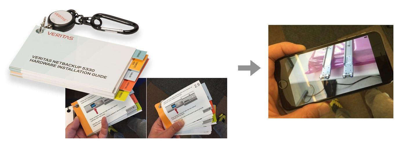
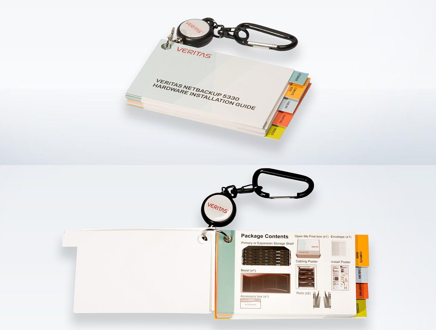 Veritas flip card
In 2015, the internal UX team created an interim solution: physical flip cards. Compared with PDFs, they were more visual and portable—you could flip through to find what you needed. They even had a keychain clip so you could attach them to clothing during work.
Still, it wasn’t perfect.
Meanwhile, the world was moving toward mobile. When everyone already carries a smartphone, not using that platform felt like a missed opportunity.
The internal UX team pushed to bring mobile into the installation experience. That early effort was led by director Jane Bungum, working with Loren Horsager and Catherine Gillis from the SaaS startup Mobile Composer. After they convinced Veritas leadership, I joined the team.
How can a mobile app improve installation UX?
Just enough. Just-in-time. Hardware help in your pocket.
That was AppAssist’s tagline. Here’s what it meant in practice.
Many data centers have strict security rules and don’t allow internet connections—to reduce risk of viruses and data breaches. Engineers were stuck reading static documents or calling Veritas support. These places are often called “dark sites.”
Video in a mobile app could improve the experience—but streaming wasn’t an option offline. So AppAssist used a download model.
In a streaming-centric world, downloads can sound outdated—but in this environment, downloads were exactly what users needed. Welcome to enterprise UX.
Leveraging existing content through a multi-disciplinary team
Several internal teams already produced installation guides as PDFs and videos.
Technically, AppAssist didn’t create brand-new instructional content. Instead, it reorganized and optimized existing content for a specific problem, specific users (customers and third-party engineers), and a specific context (installing hardware in a data center).
To do that well, we formed a multi-disciplinary team.
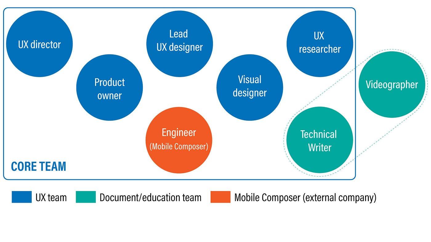 AppAssist multi-disciplinary team
It included a UX director, a product owner, a visual designer, a UX researcher, a technical writer, engineers from Mobile Composer, and myself as lead UX designer.
What mattered: the team respected existing functions and invited the right experts instead of inventing a flashy new role to take ownership.
The technical writer was the same person who had long owned technical guides. The videographer wasn’t formally on the team, but I collaborated closely—joining shoots so footage worked for mobile. Kavita Bhalerao (visual design) even helped video production with animation showing how to position servers in a rack.
In practice, we took what already existed and turned it into a mobile-friendly experience through content analysis, restructuring, and user-centered design—with tight collaboration across disciplines.
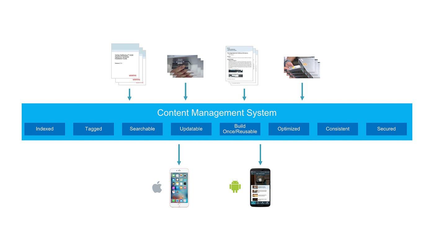 Mobile Composer’s content management system
Because Loren Horsager from Mobile Composer was central to the team, AppAssist could plug content into Mobile Composer’s CMS and use its analytics to learn usage patterns.
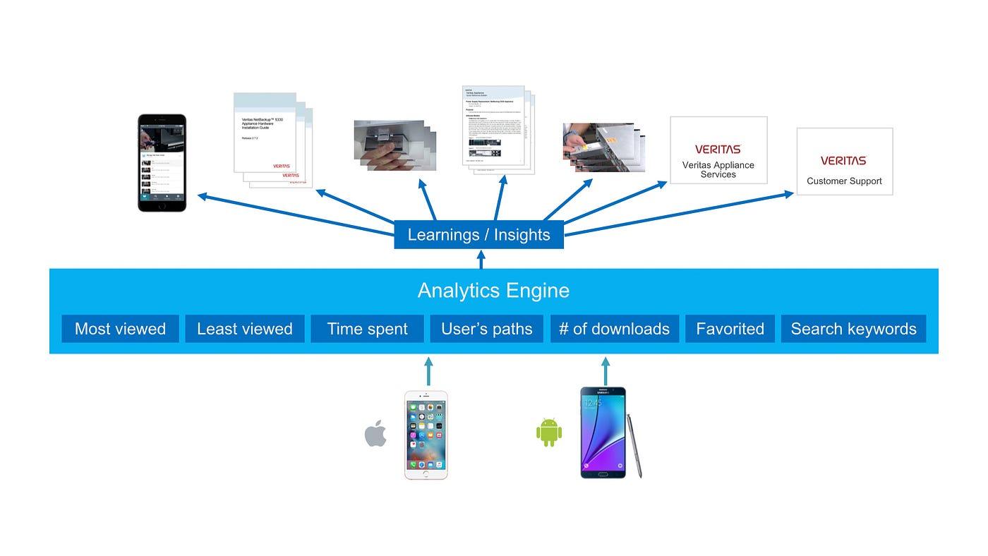 Mobile Composer’s analytics engine
The CMS made updates straightforward—Chad Busch (technical writer) could update most in-app text from a web UI without shipping a new app store release.
The platform could also capture detailed analytics—including in-depth user workflows.
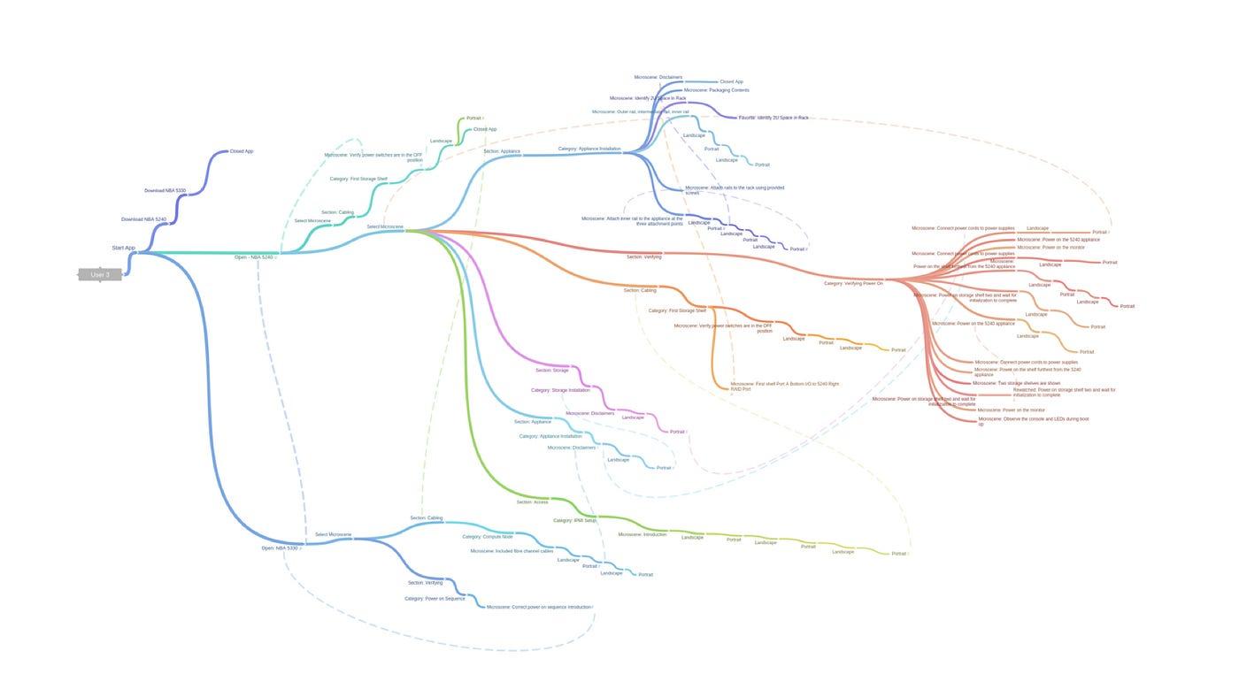 One user’s 62-minute workflows on AppAssist (Jennifer Teves)
Jennifer Teves (UX researcher) visualized a 62-minute journey for one user—helping us study how AppAssist was used during real installation work.
Concept development: from static flip cards to a video-centric experience
 From static, physical flip cards toward a video-centric experience
The flip cards were nice to have, but fragile (pages could tear off), hard to update, and limited—you couldn’t see motion. Physical formats also felt dated when everyone carries a smartphone.
A mobile app added video, animation, interactivity, and links. Video helped engineers understand how steps actually worked. To maximize that, I designed around a video-centric experience.
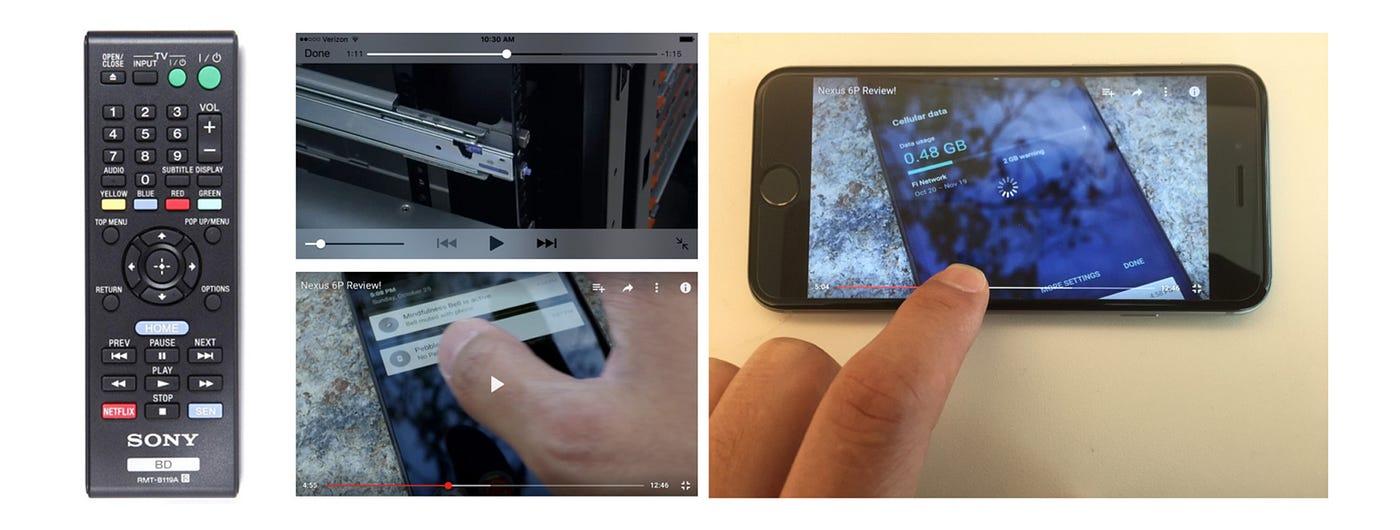 Traditional remote-style controls and a video progress bar
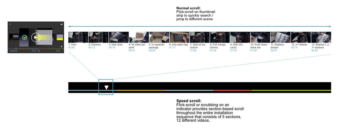
Classic transport controls (fast-forward/rewind) come from tape-era metaphors—they jump in even increments and ignore content breakpoints. Modern scrubbing helps, but it still isn’t ideal for jumping to the exact moment you need.
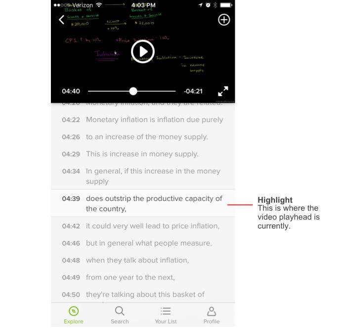
During research, I found Khan Academy’s mobile app: it listed subtitles under the video like a playlist—tap a line to jump to that moment. That content-oriented approach helped users scan key moments quickly. Our team liked it, and I took cues from it.
Deep dive into content structure
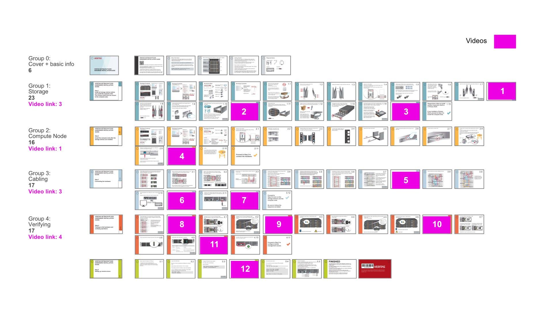
To design the experience, you need a deep understanding of the content. I broke down 88 pages of flip-card content. (Magenta-marked pages linked to videos via QR codes.)
 Flip card content structure mapping
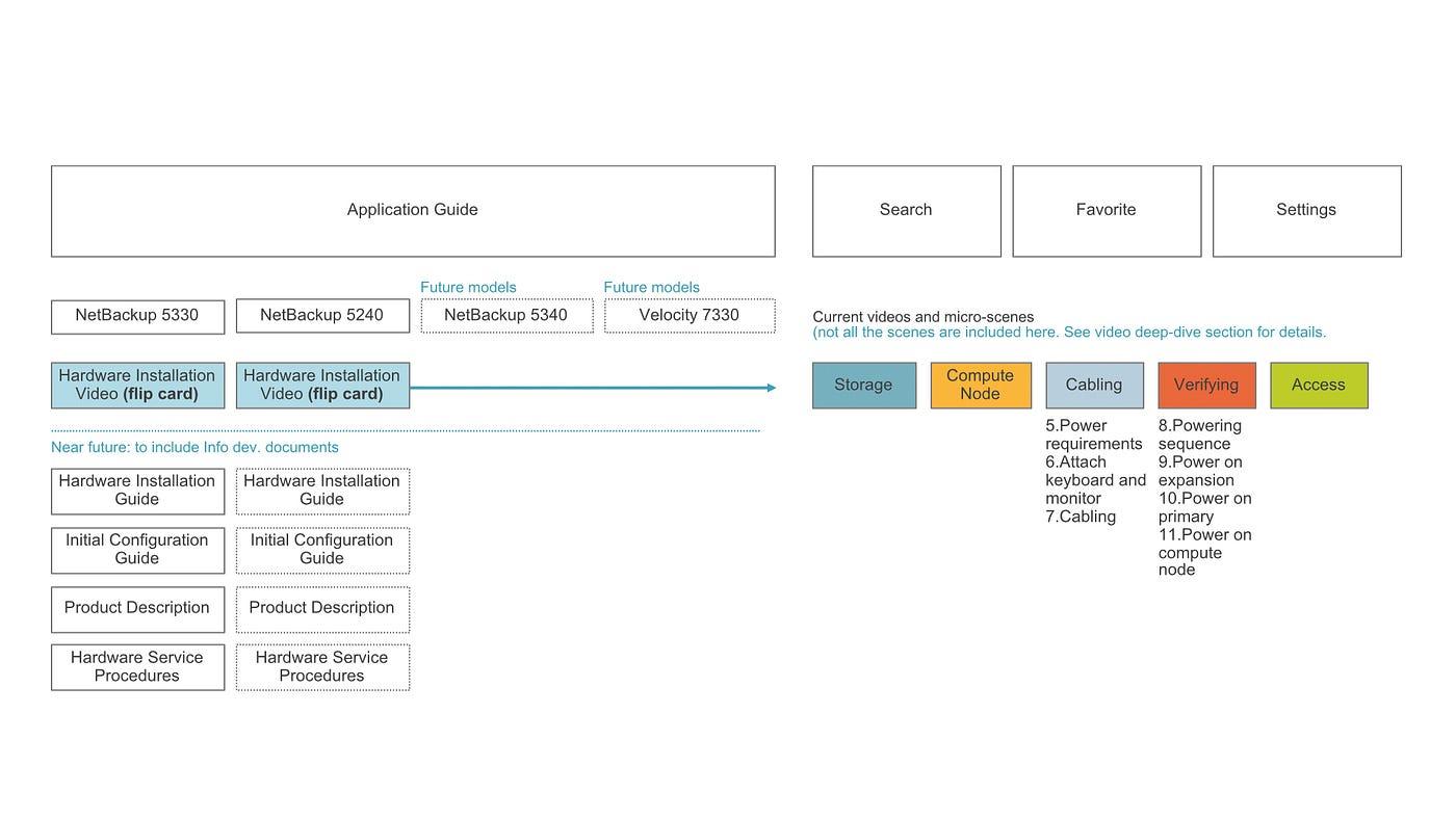
Breaking videos into “micro-scenes” for scan-ability and find-ability
Video is powerful for instruction, but finding a specific scene is hard. We introduced micro-scenes: smaller chunks within a video, inspired by Khan Academy’s pattern.
Each micro-scene was labeled for what it showed. Chad Busch recorded timestamps and named each micro-scene clearly—a huge effort that required real domain expertise.
 Each video was broken down into micro-scenes
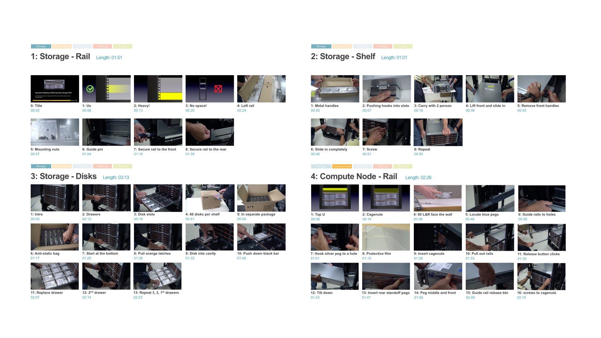 Micro-scenes labeled for scan-ability
Information architecture, driven by the content structure
IA followed from the content: organized by appliance model, then categories like storage, compute node, cabling, verifying, and access—with categories breaking down into micro-scenes.
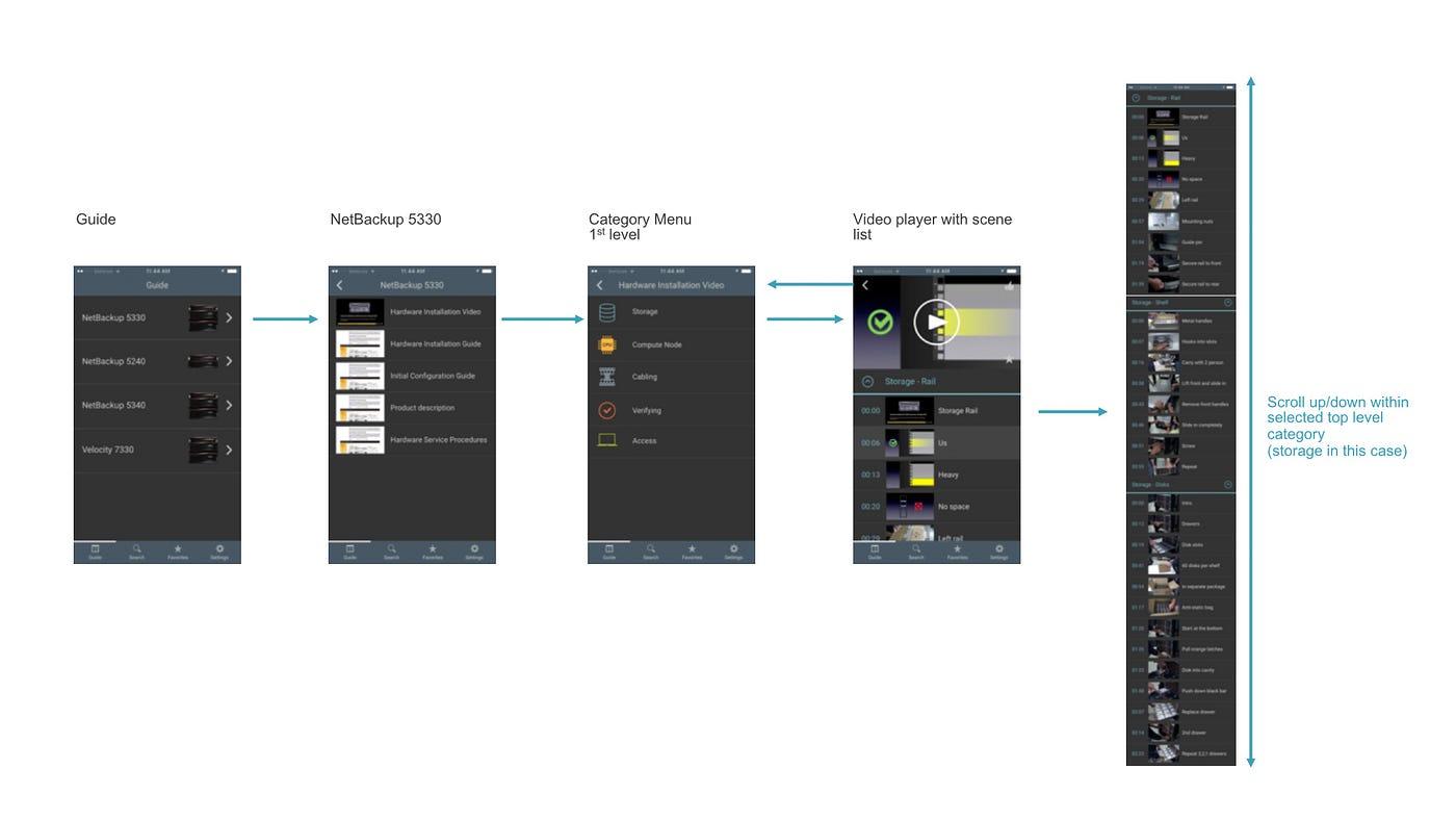
How to effectively navigate micro-scenes
Once IA was defined, the next question was interaction design: how do you find a scene quickly? I explored two models:
 a) Flat model
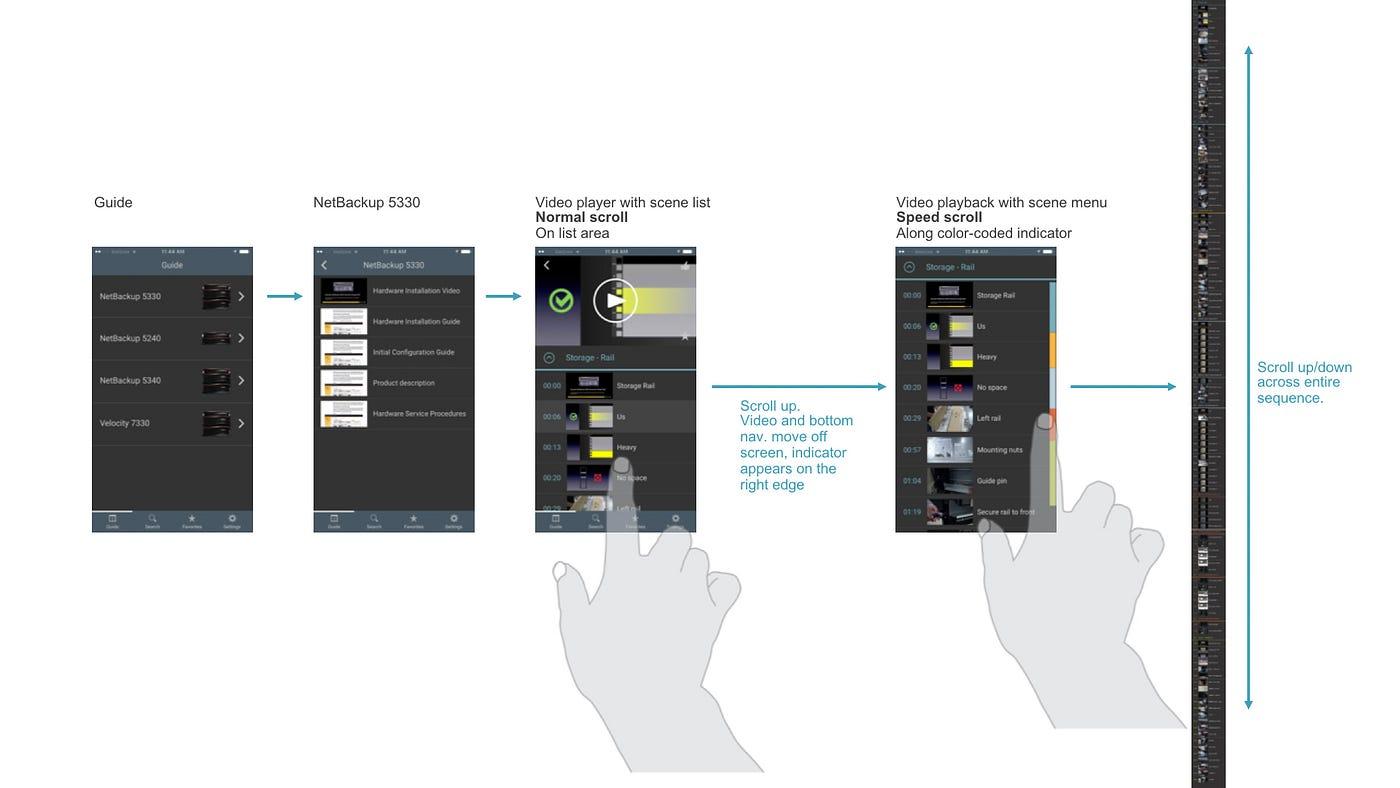 b) Hierarchical model
The flat model stitched micro-scenes across categories into one long list. The hierarchical model added a category screen before the micro-scene list.
In research (Jennifer Teves), most participants preferred the hierarchical model—it was easier to understand and made the current category obvious.
 Left: portrait speed-scroll exploration; right: landscape carousel view
I also explored faster navigation patterns (including speed-scroll). Portrait speed-scroll wasn’t implemented, but the horizontal carousel was. With the hierarchical model, lists were shorter—so speed-scroll mattered less.
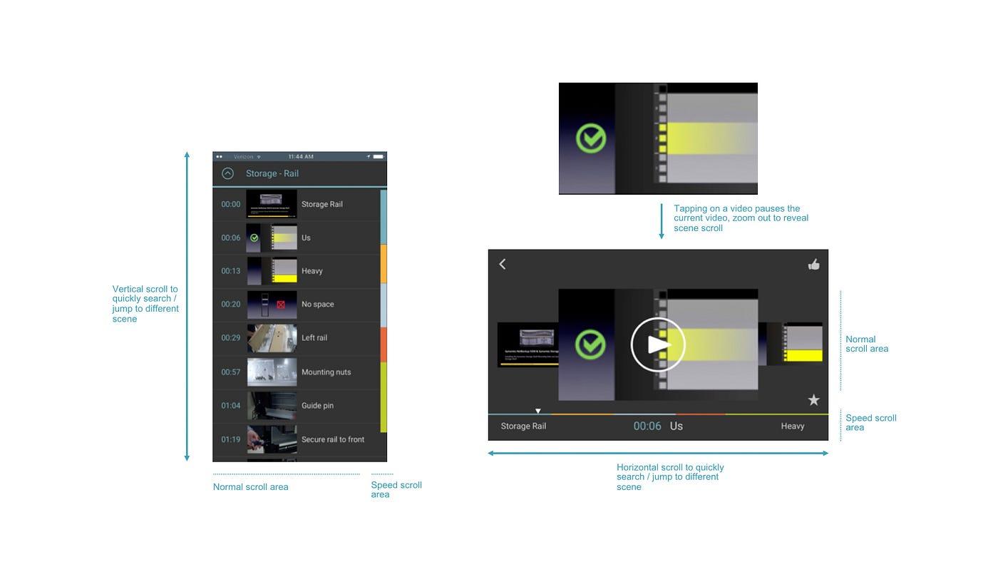 Landscape normal scroll and speed scroll via progress bar
 Landscape scroll and progress explorations (continued)
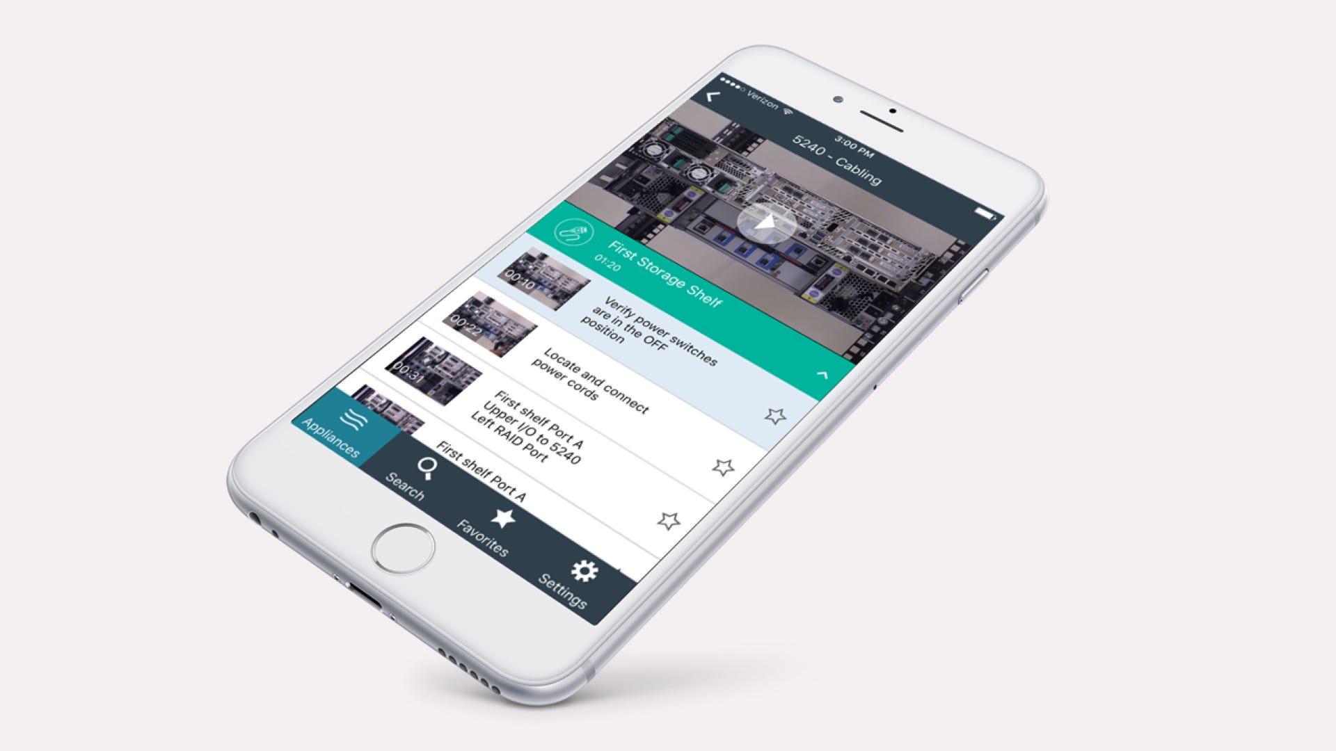
Version 1 launch
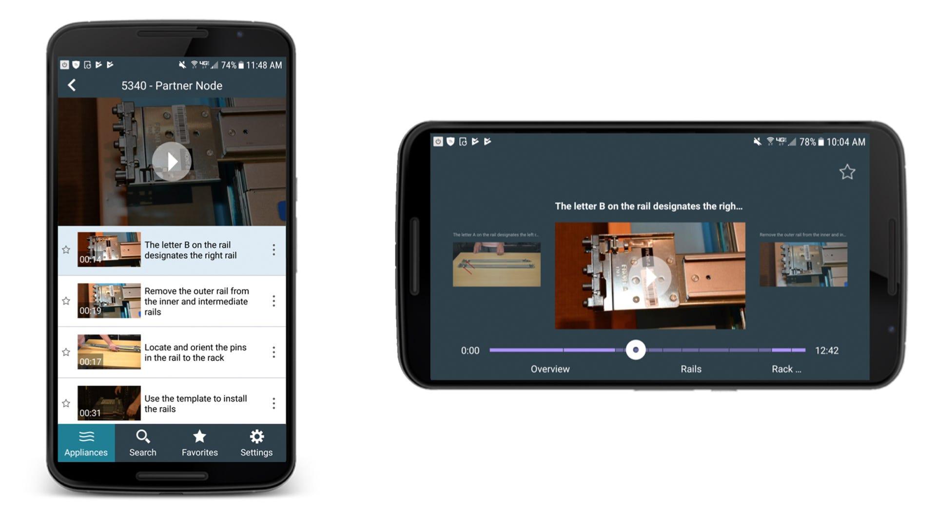 AppAssist UI: micro-scenes in portrait / landscape
AppAssist v1 shipped in 2016. On paper it might sound modest—a highly optimized installation video experience—but it helped engineers find and play the exact scene they needed. It was received well by service engineers.
Compared with PDFs or flip cards, AppAssist delivered meaningful value:
- Always-current, easier-to-scan hardware information.
- CMS-driven updates without app store friction for most text changes.
- Analytics to understand workflows and gaps in training and communication.
- Fewer support calls—expensive for the company and disruptive for field work.
Version 2 launch
AppAssist v2 shipped in 2017 with parts replacement guides. Like v1, it repurposed existing PDFs into a mobile-friendly, accordion layout—and used the same offline download approach.
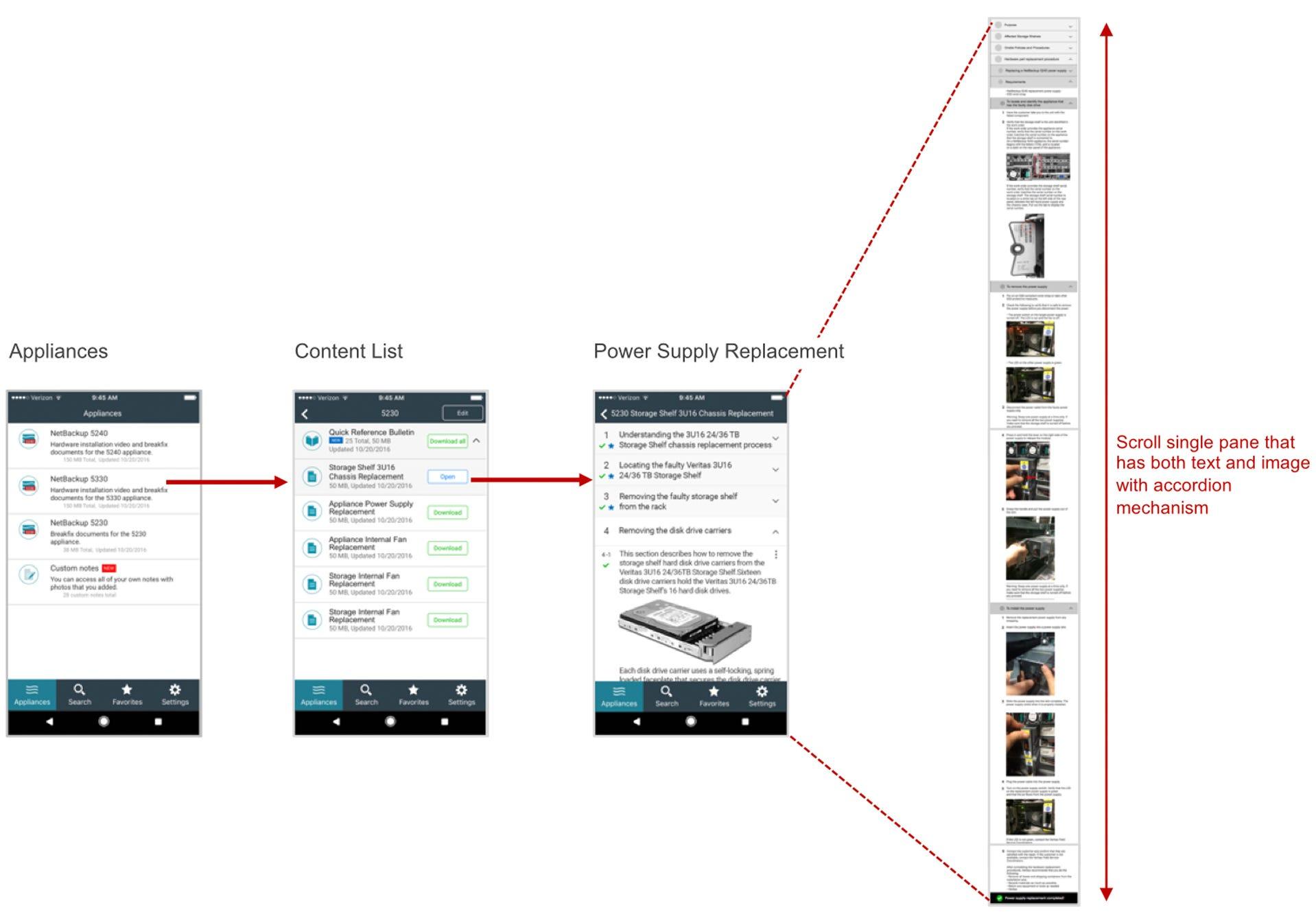 AppAssist v2: parts replacement guide (accordion format)
It wasn’t flashy—but it fit the job.
From 2016 on, AppAssist helped engineers install appliances and replace parts—guidance in their pocket. Unfortunately, AppAssist was discontinued in 2019 for financial reasons.
A rewarding experience
Even if it doesn’t look “fancy,” the project was deeply rewarding. I’m grateful I got to lead UX alongside people including Jane Bungum (director), Siddharth Mankad (product owner), Jennifer Teves (UX research), Kavita Bhalerao (visual design), Chad Busch (technical writing), Loren Horsager and Catherine Gillis (Mobile Composer), and later Raj Rath (UX research), Mark Harris (technical writing), and Stephanie Kuo (UX/visual design).
Everyone brought different expertise—and that synergy kept iteration moving.
The lesson I keep coming back to: real UX value often sits beneath the surface—in understanding users, content, constraints, and context. Enterprise companies can also offer rich research opportunities because of how closely they work with customers.
If you’ve never considered “unknown” enterprise products, they may reward you more than the flashiest consumer headline.
Mobile Composer is a Minneapolis-based startup focused on mobile apps on a SaaS platform. AppAssist was featured as one of their case studies.