What I Learned From COVID-19 Data Visualization
History of pandemics recreated based on data from Visualcapitalist.com
Designers have tremendous power and responsibility to shape how people interpret data. Two designers can slice the same facts differently—and the stories in their graphics can feel completely different. That has a huge effect on perception.
Today we are flooded with COVID-19 information visualized in many ways. Staying current matters, but I kept seeing charts that felt short-sighted—missing holistic context. Among the noise, a few visualizations genuinely helped me see the bigger picture. I want to share what I learned, and where I think we can do better.
The COVID-19 pandemic has been a trying time for all of us. The complexities of the new reality spreading across the world have forced us all to come to terms with information that is unfamiliar, scary, and confusing.
We applaud Ryu for sharing his process of learning about the virus to make sense of the world around him. Like many data visualization designers, he chose to understand the pandemic through data. While we don’t suggest he was “wrong” in his approach or in his logic, we would also like to offer some additional viewpoints throughout this article. We are thankful to Ryu for allowing us to collaborate on this article and hope the expertise of our guest editor Amanda Makulec can continue to guide evolving best practices for public health and policy.
~ Jason Forrest
Volume comparison with influenza
While the outbreak was frightening, I felt a strong need to calm down and look at numbers as objectively as I could—so I could act effectively without letting fear drive every decision. As a designer, I also felt a responsibility to contribute thoughtfully.
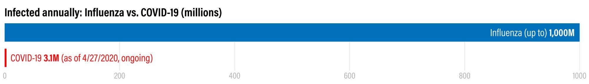 Volume comparison with influenza
 Number of people infected with influenza annually vs. number of people infected with COVID-19 as of 4/10/2020. Sources: US National Library of Medicine / NCBI, Worldometer
The infection chart above suggests that up to 1 billion people may contract influenza in a typical year (per NLM). COVID-19 case counts were roughly 1.7 million when I wrote this—and still climbing fast in April.
At the same time, I realized how little attention I usually pay to influenza’s yearly toll. My typical reaction was vague: “Oh, it’s flu season again…” COVID-19 forced me to look at influenza’s scale more honestly—something I might never have done otherwise.
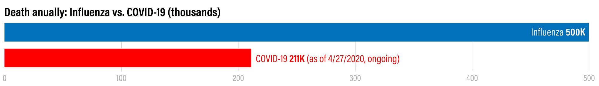
 Deaths annually: influenza vs. COVID-19 as of 4/10/2020. Sources: US National Library of Medicine / NCBI, Worldometer
From a public health perspective: The comparison of COVID-19 to seasonal flu started at the outset of the pandemic and continues to this day. One conclusion Ryu finds in these charts is worth holding on to: the seasonal flu should be taken seriously. Consider getting your flu shot!
The takeaway we’ve seen from “COVID-19 vs flu” comparisons by the numbers alone can sound like “COVID-19 isn’t that bad.” That framing can lead people to take preventive measures less seriously—social distancing, hand washing, minimizing trips, wearing a mask in public. Decisions based on a simplistic comparison are what worry us in public health.
Digging into the data, comparing these two indicators (cases and deaths in 2020) between flu and COVID-19 is misleading. Three big issues:
- Timeline: COVID-19 was an emerging pandemic with most known cases counted over a short window early in the year. Influenza is a reportable disease with seasonally adjusted reporting timelines in the US. You need a full year of quality data for both illnesses to compare fairly—especially given flu seasonality.
- Data collection and quality: In the US, COVID-19 cases and deaths were tightly linked to testing (which was inadequate early on to detect all cases). Reporting varies by state, which makes aggregation harder—and we should assume undercounting for COVID-19. Influenza has more established national reporting systems and broader testing capacity in many countries.
- Knowledge and treatment: We know much more about influenza and how to treat it than we did early on about SARS-CoV-2. Limited treatment options early in a novel outbreak is another reason “flu vs COVID” charts can mislead if they imply equal risk.
~ Amanda Makulec
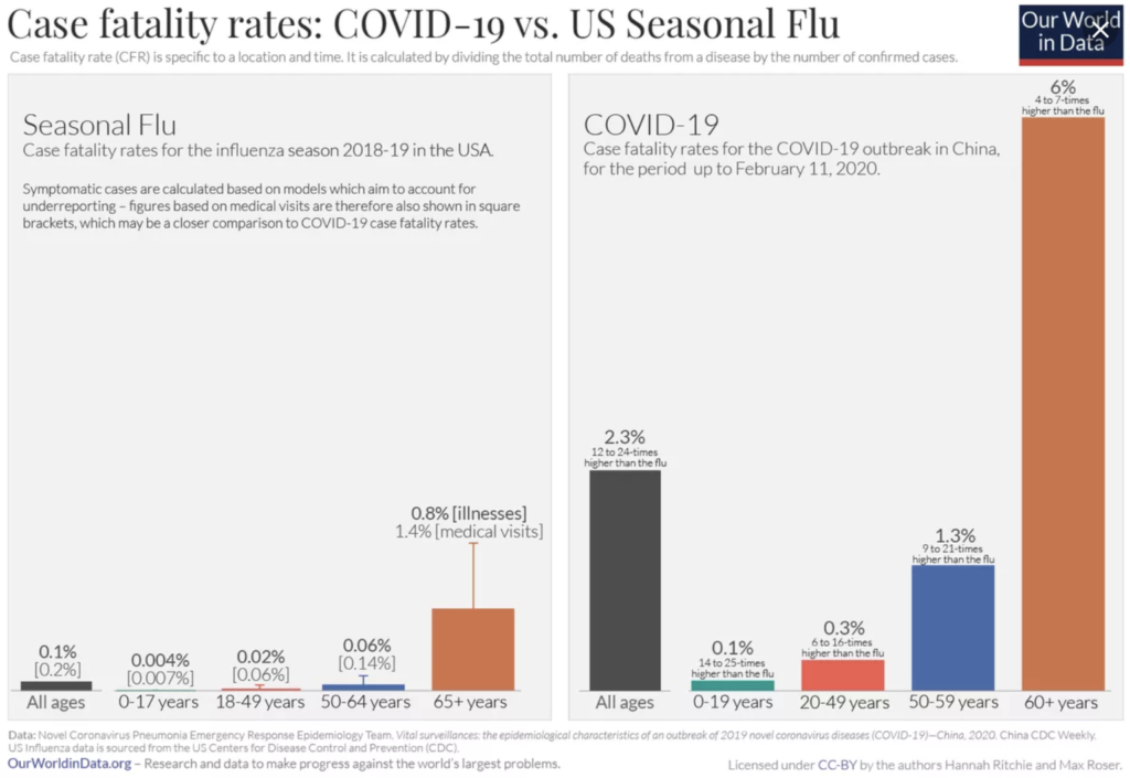
Fatality rates and Y-axis choices
When I compared deaths, COVID-19’s case fatality rate looked drastically higher than influenza for some age bands. A breakdown by age made the gap brutally clear.
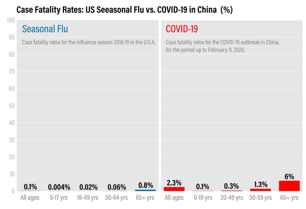 Source: Our World in Data
But I also noticed something about the chart: the Y-axis maximum was effectively anchored to the highest bar (around 6% for 60+). Because the chart shows percentages out of a total, I wondered whether the axis should extend to 100% so viewers perceive the ratio correctly.
I recreated the chart with the Y-axis max set to 100%. The bars looked less “dramatic”—because 6% is still 6 out of 100. In my opinion, that framing is more faithful for percentage-based encoding.
That said, many fatality charts I saw followed the “max = highest value” pattern. It is not necessarily malicious “data manipulation,” but it can amplify fear relative to a percentage scale. Ryan McCready’s writing on misleading graphs is a useful reference for how axis choices influence perception (Venngage).
 Our World in Data–style view recreated with Y-axis maximum set to 100%
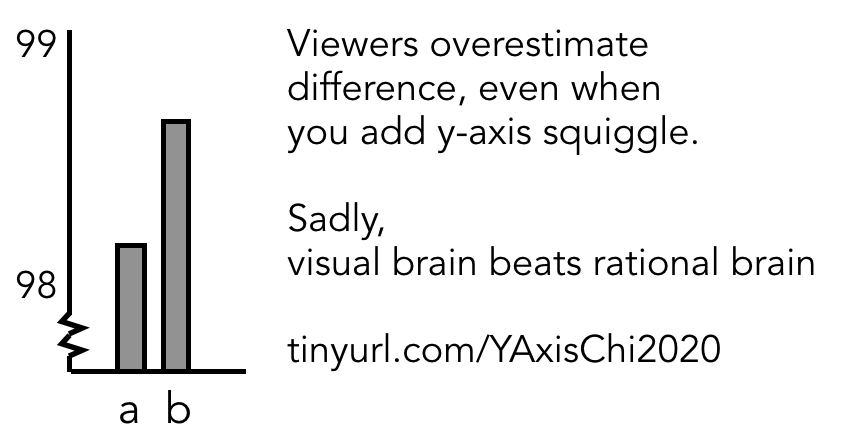 Read more in the paper “Truncating the Y-axis: Threat or Menace?” — Twitter discussion / reference image
From a public health perspective: The issues with comparing COVID-19 statistics to seasonal flu apply here too.
In addition, these charts often compare case fatality rates, which are notoriously hard to calculate early in an epidemic. Early estimates are influenced by deaths lagging behind cases (some cases in the denominator will still die) and by undercounted infections if you only include confirmed cases in the denominator. For a deeper discussion, see this Tableau interview with Dr. Ellie Murray on interpreting case fatality rates.
Cross-country comparisons can also confuse readers when the periods differ (for example, a full flu season vs. a short COVID window). Finally, age bands are sometimes uneven by design in public health charts (bins reflect risk), but inconsistent bins reduce the certainty of side-by-side comparisons.
~ Amanda Makulec
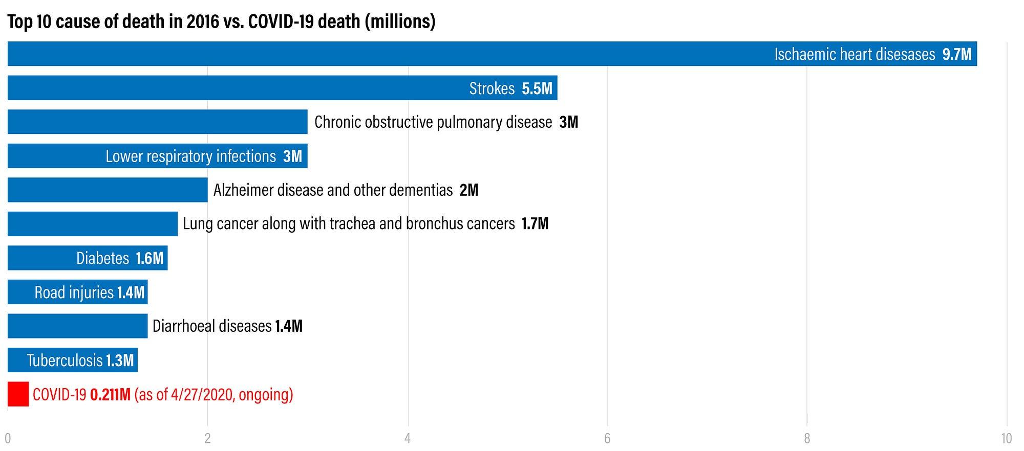
Top causes of death worldwide
While digging into COVID-19 statistics, I also wanted global context: how many people die each year, and from what causes?
According to the WHO, 56.9 million people died worldwide in 2016. That number stopped me in my tracks. It does not mean we should dismiss COVID-19—but it helped me situate the crisis inside a broader reality of mortality we rarely visualize in day-to-day life.
 Top 10 causes of death worldwide. Sources: WHO, Worldometer
From a public health perspective: Appreciating a healthy life is a lovely takeaway. I’ve also seen similar charts used to minimize COVID-19, so it’s worth unpacking why the bars aren’t always comparable.
COVID-19 deaths were still rising due to exponential spread, and deaths/cases were likely undercounted—which can make the COVID bar look artificially small next to annual totals for other diseases. It is also hard to show uncertainty bands when the undercount magnitude is unclear.
Another issue is the time period represented: if COVID-19 reflects only the first months of 2020 while other causes reflect a full year, the visual comparison can mislead even when the caption states the difference—because visual processing often beats careful reading.
If you want to explore global disease burden more rigorously, the IHME Global Burden of Disease program is a strong resource—though you may not see stable COVID-19 comparisons there immediately as data matures.
~ Amanda Makulec
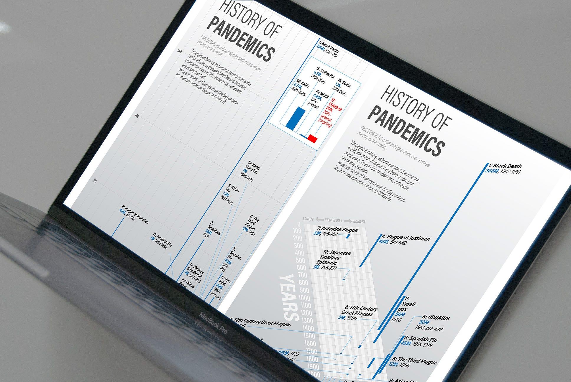
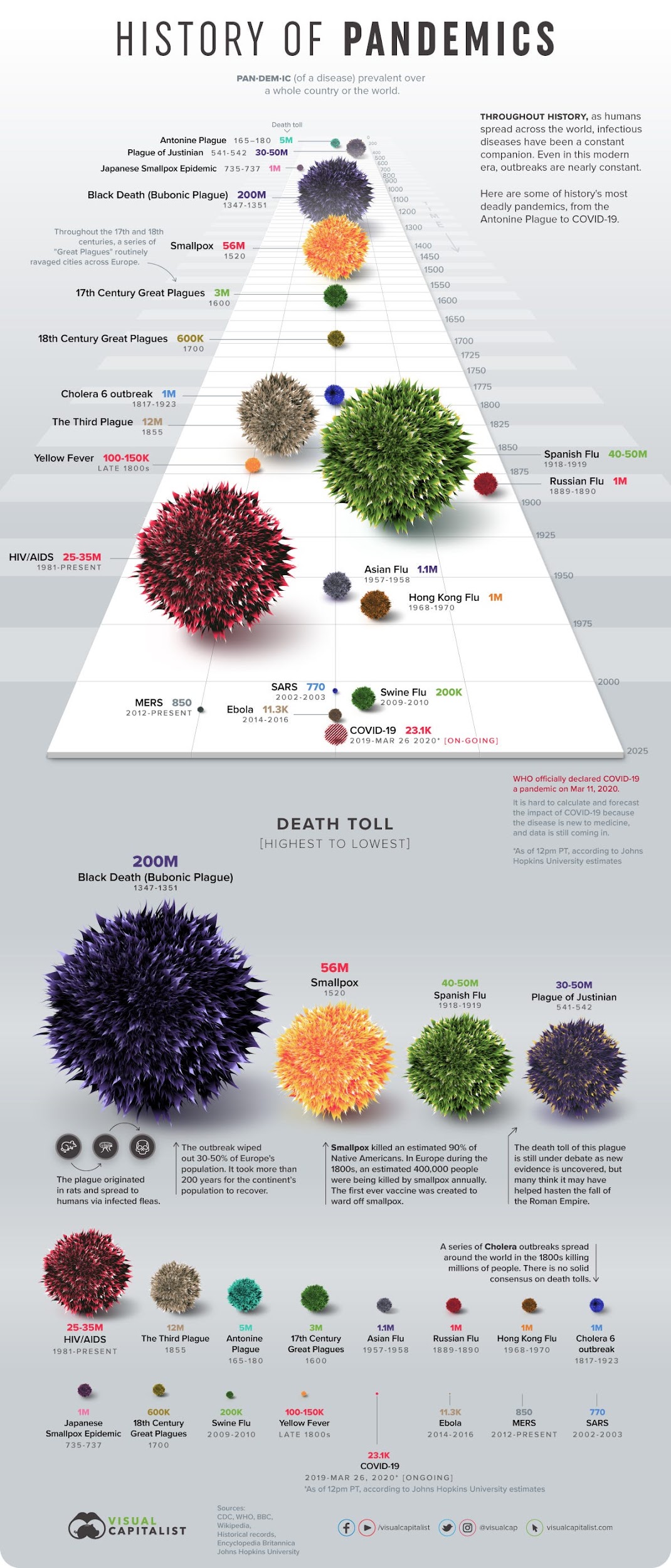
History of pandemics: what a striking visualization taught me
I came across a stunning visualization of pandemic history from Visual Capitalist. It introduced me to the idea that humans have lived alongside pandemics across centuries—not as rare exceptions, but as recurring context.
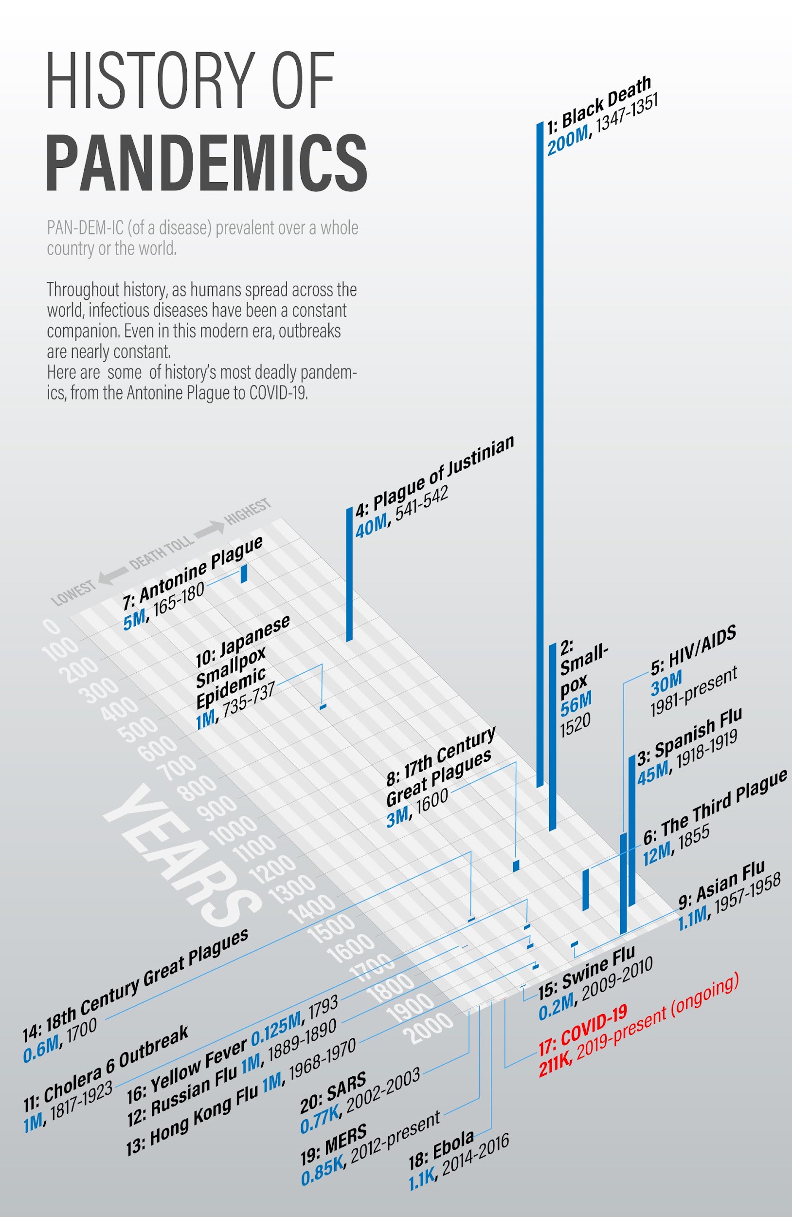 Source: Visual Capitalist — History of pandemics
The piece was visually intriguing and informative, but I also noticed design tradeoffs:
- The “virus-like” spheres were eye-catching—arguably more cosmetic than informative.
- 3D depth along the Z-axis made it hard to compare sphere sizes across eras.
- The mapping from numbers to sphere size wasn’t obvious (radius vs. area vs. volume changes how differences feel).
- Color felt somewhat arbitrary.
- Spheres were hard to place precisely on a timeline—which led to duplicating another set of spheres just for size comparison.
A different 3D approach: prioritize comparability
I recreated the dataset with a different goal: make timeline placement and relative magnitude easier to compare.
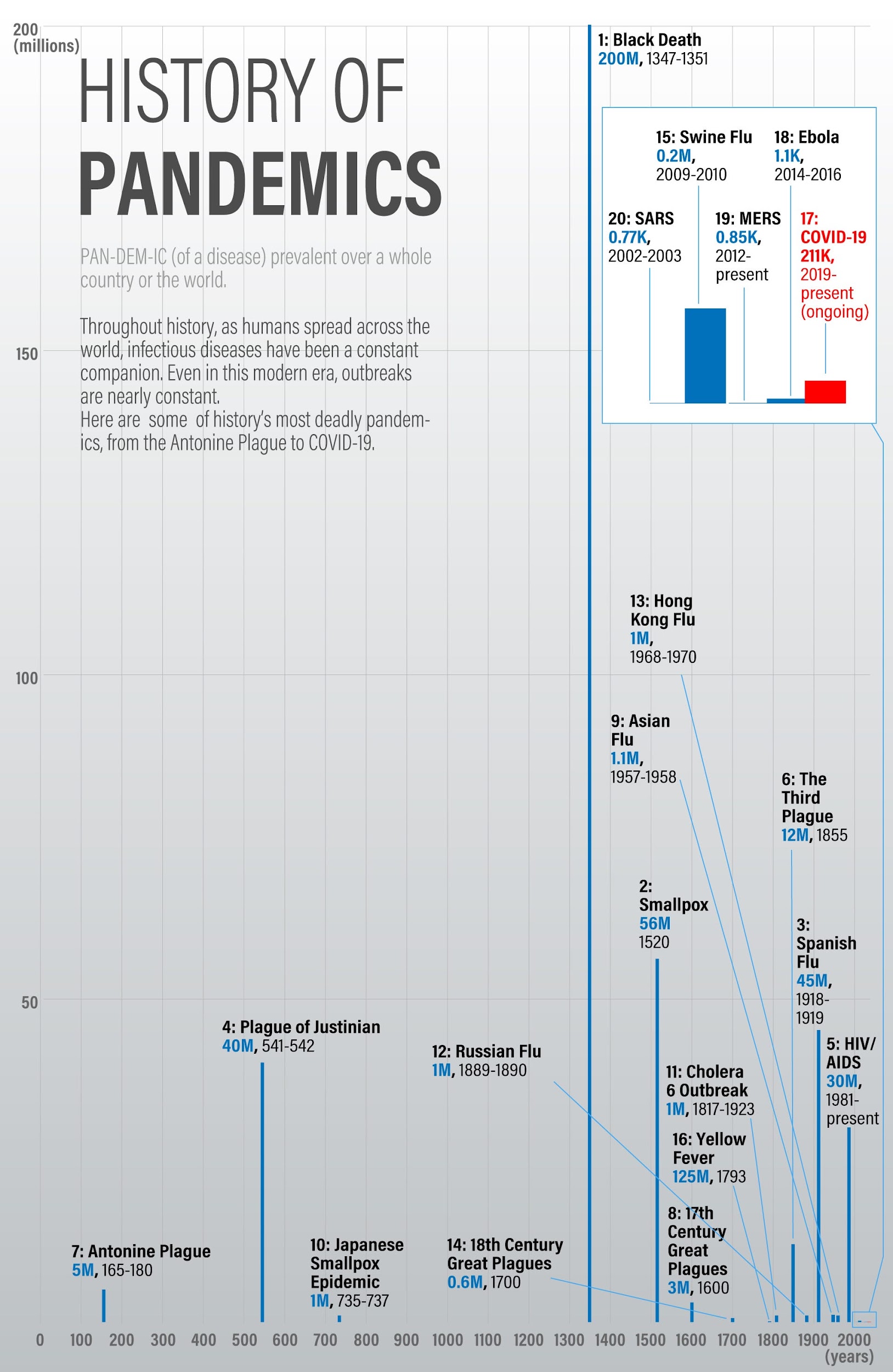 History of pandemics visualized for easier comparison — 3D bar chart. Data based on Visual Capitalist and Worldometer.
It is less glamorous than glowing spheres—but it surfaces something the original made easy to miss: the Black Death was catastrophic in a way that gets visually “quiet” when depth compresses distant points.
This 3D layout still gave a holistic view along the timeline while keeping values relatively comparable—whereas a single crowded 2D bar chart of the same dense period became a mess of overlapping callouts in my experiments. (The Word source focused on that 2D layout in text; the exported document did not include that figure as a separate image asset.)
From a public health perspective: Comparing total tolls across historical pandemics is genuinely hard in 2D—and 3D can distort perceived size depending on placement in space.
The same caution applies about comparing an emerging outbreak (with uncertain data) to historical events. Still, historical framing can be useful—as long as we don’t use graphics to justify ignoring prevention measures we cannot yet fully quantify.
~ Amanda Makulec
Cause and effect: social distancing, visualized plainly
Another chart stuck with me because it was simple—almost austere—but the story was powerful.
I found it in Vox’s piece, How we know ending social distancing will lead to more deaths, in one chart: the highest peak arrives after social distancing measures were lifted, and deaths fall again after measures return.
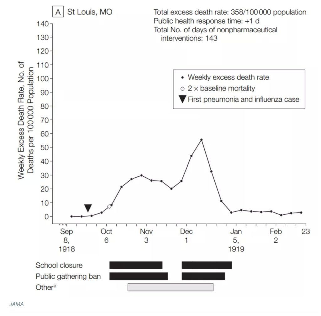 Source: Vox
From a visual design perspective, it is a basic black-and-white line chart with bars for interventions. But the composition of evidence across time is what makes it work: it communicates a causal story without over-decorating the data.
From a public health perspective: I love seeing charts from reputable sources get shared widely. I agree that more “boring” charts—no fuzzy virus balls—can be powerful if they are shared with enough context for people to interpret them responsibly.
~ Amanda Makulec
Understanding the big picture is a prerequisite for good action
Sheltering in place while absorbing endless charts was an oddly productive moment to think like a designer. It reinforced that asking good questions and seeking context matters if you want to understand the situation without being pushed around by the loudest graphic on your feed.
A few questions that helped me:
- Can I place this moment inside history—how pandemics have unfolded before?
- Do I understand influenza’s annual impact, not only as a cultural shrug?
- What does global mortality look like across causes—not only a single headline pathogen?
- Why do interventions matter, and what evidence shows their effect?
- What can I do to help myself, my family, and others?
The situation reminded me of Rachel Carson’s line from Silent Spring—the same quote I once borrowed for a “Global Village” animation I wrote about in Seeing the world as 1000 people:
The human race is challenged more than ever before to demonstrate our mastery, not over nature but of ourselves.
— Rachel Carson, Silent Spring (1962)
Understanding is not the whole job—but it is an important first step. Taking that step made me feel more prepared, not less concerned.
Thanks again to Amanda Makulec for collaborating on this piece—and for the reminder that responsible visualization is a skill we keep refining under pressure.
If you want to go deeper on responsible practice, start with Ten considerations before you create another chart about COVID-19 (Nightingale / Amanda Makulec). To sum it up: #vizresponsibly—which sometimes means not publishing a visualization publicly at all.